Logo
Logo
ServicesIndustriesCase StudiesBlogsCareersLet's Connect
blue-white-icon
black-image
Logo
ServicesIndustriesCase StudiesBlogsCareersLet's Connect
burger-icon
hamburger
blog-image
Blogs/UI/UX Design Tools 2026

Top 5 UI/UX Design Tools for 2026: What Each One Is Actually For

January 23, 2026
Share Now

Table of Contents

  1. 1. What changed since the last list you read
  2. 2. The four questions to ask of any UI/UX design tool
  3. 3. The five tools
  4. 4. How to choose: a rule, not a ranking
  5. 5. Moving between tools without losing the design system
  6. 6. Four ways a tool decision goes wrong
  7. 7. Getting the design into a shipped product
  8. 8. Frequently asked questions

Most lists of UI/UX design tools pretend the field is wide open, and it is not: one tool is the default, most teams already use it, and the real question is narrower and more useful: when is the default wrong, and what do you reach for instead?

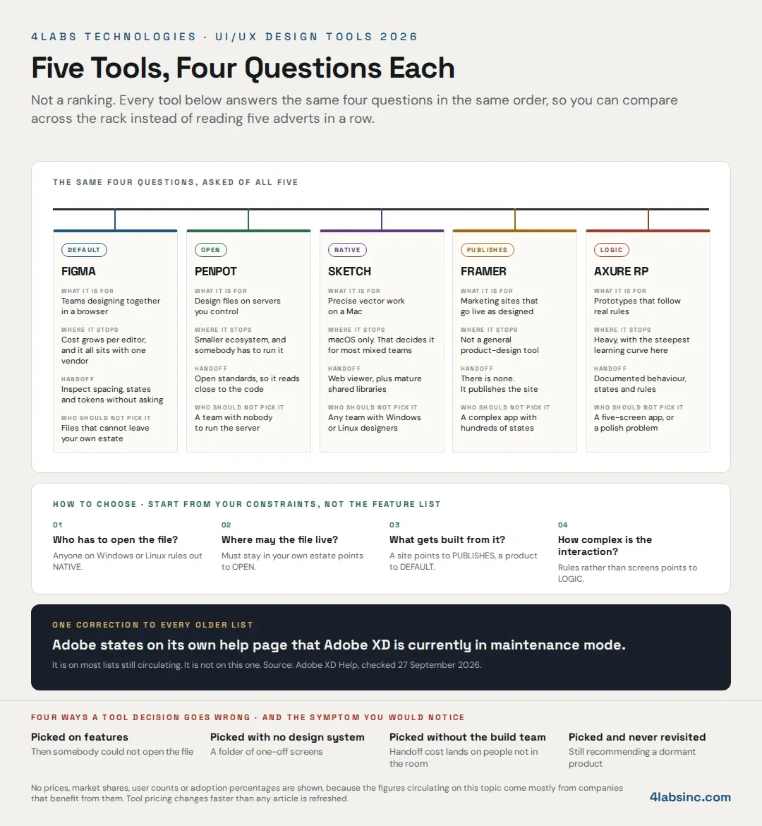
This guide answers that. Five tools, each put through the same four questions in the same order, so you can compare across them rather than read five adverts in a row. What it is for. Where it stops. What handoff to developers looks like. Who should not pick it.

The order below is not a ranking, because ranking design tools one to five implies a single best answer, and there is not one. A solo founder prototyping a landing page and an enterprise team modelling a claims workflow need different tools, and neither is wrong.

One correction before the list, because it affects almost every older article on this topic. Adobe states on its own help page that Adobe XD is currently in maintenance mode. It appears on most lists still circulating, including the earlier version of this page, but it is not on this one, and the reason is explained below.

Stay Ahead of Cyber Threats

Get expert insights, security briefings, and the latest innovations in your inbox.

  • Afghanistan+93
  • Albania+355
  • Algeria+213
  • Andorra+376
  • Angola+244
  • Antigua and Barbuda+1268
  • Argentina+54
  • Armenia+374
  • Aruba+297
  • Australia+61
  • Austria+43
  • Azerbaijan+994
  • Bahamas+1242
  • Bahrain+973
  • Bangladesh+880
  • Barbados+1246
  • Belarus+375
  • Belgium+32
  • Belize+501
  • Benin+229
  • Bhutan+975
  • Bolivia+591
  • Bosnia and Herzegovina+387
  • Botswana+267
  • Brazil+55
  • British Indian Ocean Territory+246
  • Brunei+673
  • Bulgaria+359
  • Burkina Faso+226
  • Burundi+257
  • Cambodia+855
  • Cameroon+237
  • Canada+1
  • Cape Verde+238
  • Caribbean Netherlands+599
  • Cayman Islands+1
  • Central African Republic+236
  • Chad+235
  • Chile+56
  • China+86
  • Colombia+57
  • Comoros+269
  • Congo+243
  • Congo+242
  • Costa Rica+506
  • Côte d'Ivoire+225
  • Croatia+385
  • Cuba+53
  • Curaçao+599
  • Cyprus+357
  • Czech Republic+420
  • Denmark+45
  • Djibouti+253
  • Dominica+1767
  • Dominican Republic+1
  • Ecuador+593
  • Egypt+20
  • El Salvador+503
  • Equatorial Guinea+240
  • Eritrea+291
  • Estonia+372
  • Ethiopia+251
  • Faroe Islands+298
  • Fiji+679
  • Finland+358
  • France+33
  • French Guiana+594
  • French Polynesia+689
  • Gabon+241
  • Gambia+220
  • Georgia+995
  • Germany+49
  • Ghana+233
  • Gibraltar+350
  • Greece+30
  • Greenland+299
  • Grenada+1473
  • Guadeloupe+590
  • Guam+1671
  • Guatemala+502
  • Guinea+224
  • Guinea-Bissau+245
  • Guyana+592
  • Haiti+509
  • Honduras+504
  • Hong Kong+852
  • Hungary+36
  • Iceland+354
  • India+91
  • Indonesia+62
  • Iran+98
  • Iraq+964
  • Ireland+353
  • Israel+972
  • Italy+39
  • Jamaica+1876
  • Japan+81
  • Jordan+962
  • Kazakhstan+7
  • Kenya+254
  • Kiribati+686
  • Kosovo+383
  • Kuwait+965
  • Kyrgyzstan+996
  • Laos+856
  • Latvia+371
  • Lebanon+961
  • Lesotho+266
  • Liberia+231
  • Libya+218
  • Liechtenstein+423
  • Lithuania+370
  • Luxembourg+352
  • Macau+853
  • Macedonia+389
  • Madagascar+261
  • Malawi+265
  • Malaysia+60
  • Maldives+960
  • Mali+223
  • Malta+356
  • Marshall Islands+692
  • Martinique+596
  • Mauritania+222
  • Mauritius+230
  • Mayotte+262
  • Mexico+52
  • Micronesia+691
  • Moldova+373
  • Monaco+377
  • Mongolia+976
  • Montenegro+382
  • Morocco+212
  • Mozambique+258
  • Myanmar+95
  • Namibia+264
  • Nauru+674
  • Nepal+977
  • Netherlands+31
  • New Caledonia+687
  • New Zealand+64
  • Nicaragua+505
  • Niger+227
  • Nigeria+234
  • North Korea+850
  • Norway+47
  • Oman+968
  • Pakistan+92
  • Palau+680
  • Palestine+970
  • Panama+507
  • Papua New Guinea+675
  • Paraguay+595
  • Peru+51
  • Philippines+63
  • Poland+48
  • Portugal+351
  • Puerto Rico+1
  • Qatar+974
  • Réunion+262
  • Romania+40
  • Russia+7
  • Rwanda+250
  • Saint Kitts and Nevis+1869
  • Saint Lucia+1758
  • Saint Pierre & Miquelon+508
  • Saint Vincent and the Grenadines+1784
  • Samoa+685
  • San Marino+378
  • São Tomé and Príncipe+239
  • Saudi Arabia+966
  • Senegal+221
  • Serbia+381
  • Seychelles+248
  • Sierra Leone+232
  • Singapore+65
  • Slovakia+421
  • Slovenia+386
  • Solomon Islands+677
  • Somalia+252
  • South Africa+27
  • South Korea+82
  • South Sudan+211
  • Spain+34
  • Sri Lanka+94
  • Sudan+249
  • Suriname+597
  • Swaziland+268
  • Sweden+46
  • Switzerland+41
  • Syria+963
  • Taiwan+886
  • Tajikistan+992
  • Tanzania+255
  • Thailand+66
  • Timor-Leste+670
  • Togo+228
  • Tonga+676
  • Trinidad and Tobago+1868
  • Tunisia+216
  • Turkey+90
  • Turkmenistan+993
  • Tuvalu+688
  • Uganda+256
  • Ukraine+380
  • United Arab Emirates+971
  • United Kingdom+44
  • United States+1
  • Uruguay+598
  • Uzbekistan+998
  • Vanuatu+678
  • Vatican City+39
  • Venezuela+58
  • Vietnam+84
  • Wallis & Futuna+681
  • Yemen+967
  • Zambia+260
  • Zimbabwe+263
Our Services
Digital Marketing
Staff Augmentation
IT Infrastructure
ERP Solutions
Software Development
Web & App Development
Industries
Cryptocurrency and Blockchain
Banking, Financial Services, and Insurance (BFSI)
Lending and FinTech
Oil and Gas
Energy and Utilities
Automotive and Manufacturing
Agriculture
Real Estate
E-commerce and Retail
Case Studies
Financial Services Test Automation
AI-Driven Customer Risk Profiling
Elevating Mobile Performance
Jewelry Client Transformation
AI Underwriting Revolution
Advanced Cybersecurity Solutions
Eyewear Retailer Transformation
Revolutionizing Manufacturing Operations
Offshore Development Excellence
Company

About Us

Careers

Let's Connect

Business Referral

Engagement Model

Partnership Programs

Resources

Blogs

footer1-iconfooter2-iconiso_iconiso_icon2

4labsicon

Copyright © 2026 4Labs Technologies. All Rights Reserved.

Privacy Policy

Terms & Conditions

Accessibility

fb-icon
twitter-icon
instagram-icon
linkedin-icon

No prices appear here, because tool pricing changes faster than any article is refreshed, and a stale number is worse than none. Cost is discussed as a shape instead: what you pay per, and what grows it. No market shares, user counts or adoption percentages either, because on this topic nearly every such figure comes from a company that benefits from it.

If you want the method before the tool, our guide to user-centred design covers the thinking any of these are meant to serve.

What changed since the last list you read

Three things moved, and together they explain why a 2026 list should not look like a 2022 one.

The default settled, so the question changed

Search for design tools now and you do not get top five tools pages at the top. You get alternatives pages. Alternatives for wireframing, for UI design, open-source alternatives, AI-powered alternatives.

That is worth reading carefully, because search behaviour is the most honest signal you get about a market. People are not asking which tool to start with, because they have one; they are asking what else exists, what it would cost them to move, and whether the thing their team complains about has a fix.
So a useful page on UI/UX design tools for 2026 is not an introduction to five options; it is a map of when to leave the one you are on.

One name on most old lists is no longer a safe pick

Adobe XD appears on a great many design tool lists, including the previous version of this page. Adobe's own help page for XD states that it is currently in maintenance mode.

That is not an opinion about whether the software still works, because it does; it is a statement about what you are choosing when you standardise a team on it: a product not in active development, with a plugin ecosystem that follows development, and a hiring pool that follows the ecosystem.

For a tool you will build a design system in and train people on, that is a decision with a tail. So XD is not one of the five below, and any list that still recommends it without saying this is worth reading sceptically.

What decides it now is what happens after the canvas

The old comparisons were about drawing: vector editing, artboards and pen tools, and every serious tool crossed that bar years ago.

What separates them in 2026 is everything downstream. How a component library is defined and kept in step. How a developer gets from a frame to a build without a meeting. Whether a prototype can express real conditional logic or only a click path. What it costs, in weeks, to move a real design system somewhere else.

Those are engineering questions, not drawing questions, and they are the reason a web and app development team has a view on this at all. They are also why the four questions below are the ones asked of every tool here.

The four questions to ask of any UI/UX design tool

Feature lists do not help, because every tool has every feature in some form, but these four do, and they are the frame used for all five below.

What is it for? The job the tool was built to do well, not the job its marketing claims. A tool built for real-time collaboration and a tool built for interaction logic behave differently even when their feature lists look similar.

Where does it stop? Every tool has a wall: price at scale, platform, ecosystem or complexity. Knowing where the wall is before you commit is worth more than any feature you will use twice.

What does handoff look like? How a design reaches the people who build it. Whether a developer can read spacing, tokens and states without asking. Whether the tool exports something usable or only something viewable. This is where most of the cost of a tool choice actually lands.

Who should not pick it? The question no vendor page answers, and the fastest one to read. If you are the person described, stop and look at the next entry.

Why this beats a feature-parity table: a table tells you what exists, not what it costs you. Tables also go stale within a quarter, while these four answers hold for years, and a good UI/UX design tool decision is nearly always a constraint decision rather than a feature decision. Our post on what good UX does to conversion makes the case for why the outcome, not the toolkit, is what you are buying.

The five tools

Figma: the default, and when the default is right

What it is for

Multiple people working in the same file at the same time, in a browser, with a shared component library underneath: that is the job Figma was built for, and it is still the one it does better than anything else.

The parts that matter in practice are the design system parts. Components with variants, so one button covers its whole family. Variables for colour, spacing and type, so a change lands everywhere. Auto layout, so a component survives a longer label instead of breaking. A plugin ecosystem large enough that whatever odd thing you need, somebody has built it.

For most product teams, a browser-based tool with real collaboration and a maintained design system is the whole requirement, and that is why it became the default rather than marketing.

Where it stops

Cost at scale is the first wall, and it is a shape rather than a number: you pay per person who edits, so that is fine at five designers and becomes a conversation when thirty product managers want to change a label themselves.

The second wall is concentration. The files, the system, the history and the prototypes live with one vendor, in a format the tools around it read best. That is not a criticism, it is what a default is, and it is only a problem if a policy, a client or a regulator says your design assets cannot sit in someone else's cloud, which is the case Penpot answers.

Handoff

Strong, and the main reason it holds teams. A developer opens a frame and reads spacing, type, colour and component state without a meeting. Variables map onto design tokens, which is what makes a system survive contact with code.

The honest caveat is that the generated code is a reference, not a build, so treat it as a specification a developer reads rather than output you ship, and it works very well. Prototypes handle motion and transitions well enough for review, which is where our post on the role of animation in user experience is worth reading alongside.

Who should not pick it

Teams whose files cannot live in a vendor's cloud. Teams whose prototypes need genuine conditional logic rather than click paths. And teams of one or two building marketing pages, who will get to a live site faster with Framer.

Penpot: the open-source one you can host yourself

What it is for. The same job as the default, on infrastructure you control: Penpot is open source and can be self-hosted, so the design files sit on your servers rather than a vendor's. It is browser-based and collaborative, and it is built on open web standards rather than a proprietary file format.

That matters in three situations, and they are more common than the SERP suggests. A client contract or a regulator says project assets stay inside your environment. Procurement will not approve another cloud subscription. Or you have been burned once by a tool changing terms and want the files somewhere you decide about.

Where it stops. The ecosystem is smaller: fewer plugins, fewer templates and fewer people who have already solved your odd problem. And self-hosting is not free just because the licence is: somebody has to run it, update it and back it up, which is real infrastructure work rather than a checkbox.

Handoff. Good, and philosophically different, because it is built on open standards, so what a developer inspects is closer to what they will write. For teams where designers and front-end developers sit together, that shortens the conversation.

Who should not pick it. A small team with nobody to run the server, if you self-host. Teams that depend heavily on a specific plugin. And anyone who needs the largest possible hiring pool of people already fluent in the tool.

Sketch: the native macOS vector editor

What it is for. Drawing, properly, on a Mac. Sketch is a native application rather than a browser tab, and it feels like one: fast on large files, precise, and with a mature library model that predates most of its competitors.

If your work is heavy on detailed vector craft, icon sets and tightly maintained symbol libraries, this is still a first-rate tool, and its age is an advantage rather than a liability. The conventions are settled.

Where it stops. macOS only, and that single fact decides it for most mixed teams before any feature comparison begins, because the product manager on Windows cannot open the file, and neither can the client.

Collaboration is real but arrived later than in browser-first tools, and it shows in how teams work around it rather than with it.

Handoff. Solid through its web viewer, where a developer can inspect without owning a Mac, and symbols and shared libraries translate cleanly into a design system. The friction is upstream, in who can open and edit, not downstream.

Who should not pick it. Any team with Windows or Linux designers. Any team whose stakeholders need to comment inside the file. And anyone starting fresh in 2026 without an existing Sketch library worth keeping.
ui-ux-design-tools-2026-rack.webp

Framer: design that publishes as a live site

What it is for. Skipping the handoff entirely: in Framer the design is the site and you publish it, so for a marketing site, a landing page or a launch microsite, that removes a whole stage from the process and a whole set of arguments with it.

It also means what you review is the real thing on a real device, not a prototype pretending. Responsive behaviour, interactions and page speed are all visible before anyone commits, and our post on responsive web design explains why that matters more than it used to.

Where it stops. It is not a general product-design tool, and treating it as one is the mistake to avoid, because a complex application with hundreds of states and a large component library is not what this was built for. You are also designing inside its publishing model, which is the trade you make for skipping the build.

Handoff. There usually is not one, which is the point, though where a Framer page has to feed a separate codebase, it is weaker than the others, because the output is a published site rather than a specification.

Who should not pick it. Product teams building a complex application. Teams whose engineering organisation owns the front end and will not host a site elsewhere. And anyone who needs one tool for both the marketing site and the product.

Axure RP: prototypes with real logic

What it is for. Interaction, not pictures: Axure prototypes hold conditional logic, variables, states and data, so a screen can behave differently depending on what the user did three steps earlier.

For enterprise software, that is the whole job, because a claims workflow, an approval chain, a pricing configurator or an internal admin tool is hard because of the rules rather than the visual design. A click-path prototype cannot test those rules, and a real one can, which is why Axure survives in a market that has otherwise consolidated.

It is also the tool that pays back most in user testing, because what you put in front of somebody actually responds. Our guide to running user testing on it covers how to get a usable answer out of that session.

Where it stops. It is heavy: the learning curve is steeper than anything else here, the visual output is less polished, and the collaboration model is not browser-native in the way the others are.

Handoff. Specification-led rather than pixel-led, which suits its audience, so developers get documented behaviour, states and rules. It is the only tool on this list where the prototype itself can serve as functional documentation.

Who should not pick it. A small team building a five-screen app. Anyone whose bottleneck is visual polish rather than interaction rules. And teams without a business analyst or a product person willing to learn it properly.

How to choose: a rule, not a ranking

Start from your constraints rather than the feature lists: four questions, in this order, and each answer eliminates rather than recommends.

Who has to open the file? If anyone on Windows or Linux needs to open, comment or edit, Sketch is out, and this is the single most common reason a tool choice is reversed six months later, though it takes thirty seconds to check.

Where may the file live? If a contract, a regulator or your own policy says design assets stay inside your infrastructure, Penpot is the answer and the rest are conversations with procurement. If there is no such constraint, this question costs you nothing to skip.

What gets built from it? A marketing site or landing page points at Framer, because publishing directly removes a stage, while a product with a real front-end codebase points at Figma or Penpot, because what you need is a specification a developer can read. If your framework decision is still open, our guide to choosing a web development framework comes before the tool question, not after it.

How complex is the interaction? If the hard part is rules rather than screens, Axure: conditional flows, states that depend on history, data-driven behaviour. If the hard part is screens, anything else on this list.

Answer those four and you usually have one tool left, sometimes two. If two survive, pick the one more of your team already knows, because fluency beats features on a three-month horizon.

If your product is an app rather than a site, read the answers through that lens — our post on mobile app UX design covers what changes when the screen is small and the context is not a desk.

One case the rule does not cover: if you have no design system, no component library and no agreed spacing scale, the tool is not your problem yet. Any of the five will hold a mess equally well, so fix the system first and the tool question answers itself.

Moving between tools without losing the design system

The articles that tell you to switch rarely tell you what switching costs. It is not the files, which export and import roughly, it is everything the files depended on.

The three things that do not survive a migration

Component logic. Variants, nested components and the rules that make one button cover its whole family are expressed differently in every tool. An export usually gives you the shapes and loses the structure, so a designer rebuilds the library by hand, and budget for that as a project rather than an afternoon.

Design tokens and their bindings. Colours and spacing values move across fine, and what breaks is the binding between a token and everything using it, so a change that used to land everywhere now lands nowhere until somebody rewires it. This is the one that quietly hurts the build team, because the front-end code was keyed to those names.

Prototype logic. Click paths mostly survive, while conditional flows, variables and state generally do not, which is why teams moving away from Axure usually discover halfway through that their prototype was documentation.

What to rebuild first: the component library, before anybody designs a new screen in the new tool. Teams that skip this end up with two systems, the old one in the old tool and an accidental one in the new, and merging them costs more than the migration did.

One first-party note. The pattern we see most often is not a bad tool choice but a handoff where the design system in the tool and the component library in the code drifted apart, so every new screen needs a conversation to interpret. That is weeks of build time a year, and it shows up as "the designs keep changing" rather than as a tooling problem. Keeping the tokens in the tool and the tokens in the code named the same is most of the fix, and it is worth doing before you consider moving anywhere. Our post on web development trends covers where the build side of that is heading.

Four ways a tool decision goes wrong

Picked on features rather than on who has to open it. The comparison table said yes to everything, and then the product manager on Windows could not open the file, so ask who needs access before you read a single feature list.

Picked before the design system existed. With no components, no tokens and no spacing scale, every tool produces the same result: a folder of one-off screens. The tool does not create a system, it holds one.

Picked by designers alone, with the build team told afterwards. Handoff is most of the cost of a tool choice, and it lands on people who were not in the room; twenty minutes with a front-end developer before the decision saves months of interpreting.

Picked and then never revisited. This is how an article ends up recommending a product in maintenance mode, and how a team ends up on a tool that stopped fitting two years ago. Put a date in the calendar, once a year, to ask whether the four questions still give the same answer.

Getting the design into a shipped product

Two conversations, depending on where you are.

Designs done, no capacity to build them. Send us the file, whichever tool it is in, and we will tell you what is buildable as drawn, what needs a decision before anyone starts, and where the component library is doing something the front end cannot reproduce cheaply. That read takes an hour and usually changes the estimate.

A handoff that keeps costing weeks. The symptom is that every sprint contains a conversation about what the design meant, and the cause is nearly always drift between the design system in the tool and the component library in the code. The fix is naming and structure rather than a new tool, and it is faster than anybody expects.

Our web application development team builds from any of the five tools above, and cares more about your component library than your choice of canvas. For work beyond the web front end, software development covers the rest of the product.

No obligation, and no pitch deck.

Frequently asked questions

What is the best UI/UX design tool in 2026?

There is no single best one, and any list that names one is answering a different question than yours. Figma is the default for collaborative product design and the right answer for most teams. Penpot is the answer when files must stay on your own infrastructure. Sketch suits Mac-only teams doing detailed vector work. Framer suits marketing sites that publish directly. Axure suits enterprise software where the interaction rules are the hard part.

Is Figma still worth it in 2026?

For most product teams, yes: real-time collaboration, components with variants, variables that behave like design tokens, and a handoff a developer can read without a meeting still add up to the strongest package. The two reasons to look elsewhere are cost at scale, since you pay per editor, and any policy that stops design files living in a vendor's cloud.

What is the best free or open-source UI/UX design tool?

Penpot, which is open source, can be self-hosted, and is built on open web standards rather than a proprietary format, so design files stay in infrastructure you control. The trade is a smaller plugin ecosystem and the real work of running the server, updating it and backing it up.

Is Adobe XD still usable in 2026?

Adobe states on its own help page that Adobe XD is currently in maintenance mode, though existing files still open and the application still works. What you are choosing, if you standardise on it, is a product not in active development, with an ecosystem and a hiring pool that follow development. For a tool you will build a design system in, that is why it is not on this list.

Which UI/UX design tool is best for developer handoff?

Figma for most teams, because a developer can inspect spacing, type, colour and component state without asking, and variables map onto design tokens; Penpot for teams where designers and front-end developers work closely, since it is built on open standards; and Axure where the specification is behavioural rather than visual. Framer removes the handoff instead of improving it, by publishing the site directly.

Do I need a separate prototyping tool?

Usually not, because Figma, Penpot and Framer all prototype well enough for review and for most usability sessions. You need a dedicated prototyping tool when the behaviour depends on conditions, variables or data rather than on which button was clicked, and that is the case Axure exists for.

‹ PreviousNext ›